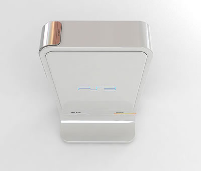
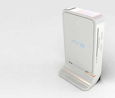
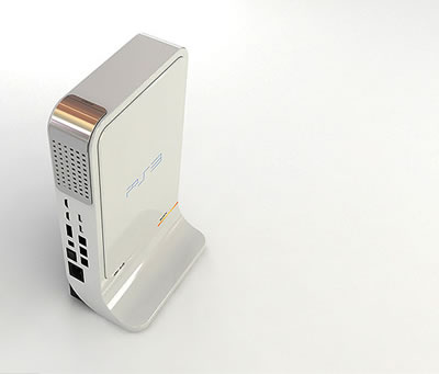
[VG News] PS3 Console-Design Fan Concept
Jetzt mal unter uns: wer von euch ist nicht mit dem gegenwaertig geplanten Design fuer die PS3 zufrieden? Ich persoenlich kann nicht klagen. Ein flacher Deckel haette mir zwar mehr gefallen, weil man deswegen mehrere gleichartige Konsolen stapeln koennte - aber mal ehrlich: wer macht schon sowas? ;^)
Nein, nein, nein - so wie sie jetzt bekannt ist, gefaellt sie mir eigentlich praechtig, besonders in schwarz. Aber manch Einer ist da etwas anderer Meinung. [...]
(Read More)(Read Less)
<<
How the PS3 shoulda been ?
13 March 2006 · by Kyle Miller
Does aesthetics make that much of a difference?
The fashion/tech fans at Electroplankton have a write up today about the PS3’s aesthetics. Instead of the Spider-Man font using version of the console it looks like we’re getting, the author prefers a cleaner, more industrial look for the system.
"I much prefer the design concept by industrial designer Jaren Goh. His iteration of the PS3 is slick, seems balanced, and takes that age old design philosophy that less is always more. The actual acronymic Playstation logo highlighted by version number, to me is more powerful and memorable than writing it across the machine. In a way, its iconic because we see that logo everywhere and yet Sony decided to go and change it. Right now, its just three characters and the number "3" allows for both perfectly symmetry and/or asymmetry depending on where it's placed. I also like how Goh's design in the disc drive keep the exterior lines of the unit clean. It also has height, and seems to tower when placed vertically, and that smooth curve from body to foot stand is just beautiful. The mesh grill that all of the next generation game consoles have has a chrome plate on it, making it a part of the design as opposed to an afterthought of where to drill the holes. "
Is the way your game consoles look that important to you?
Source: Transim.com
>> # top # | Q: PS3 Center.net
mein erster Gedanke war: ein futuristischer Grabstein!
mein zweiter Gedanke war: ein futuristischer Muelleimer!! *rotflol*
aber davon mal abgesehen, finde ich, hat die Idee was ...
Labels: videogame news


0 Comments:
Post a Comment